|
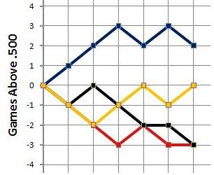
How it works I used to have a long explanation here. But the charts are simple. If a team wins, its line rises. If it loses, the line falls. If it has a bye week, the line goes straight across for that week. Easy enough? Look at this sample:
The blue team won its first three games (its line was rising). Then it lost, won, and lost. Its line is higher than the others right now, so it is leading its division (but the yellow team is closing the gap!). The red team lost its first three games. (You can't see its line for the first two weeks because it is under the line of the yellow team, which also lost its first two games.) Then the red team won, lost, and had a bye (its line goes straight across). You can figure out what has happened with the other two teams. Early in the season, some of the lines overlap, but over time, everything gets clearer. So — keep up with current NFL standings here! We also have charts from many previous NFL seasons. Check them out! Questions? Ideas? Drop me a line: |
|
Part of the Randomo.com group of websites. All contents © 2003-2016 — Randomo.com |


 Facebook
 Twitter
 Digg
Digg